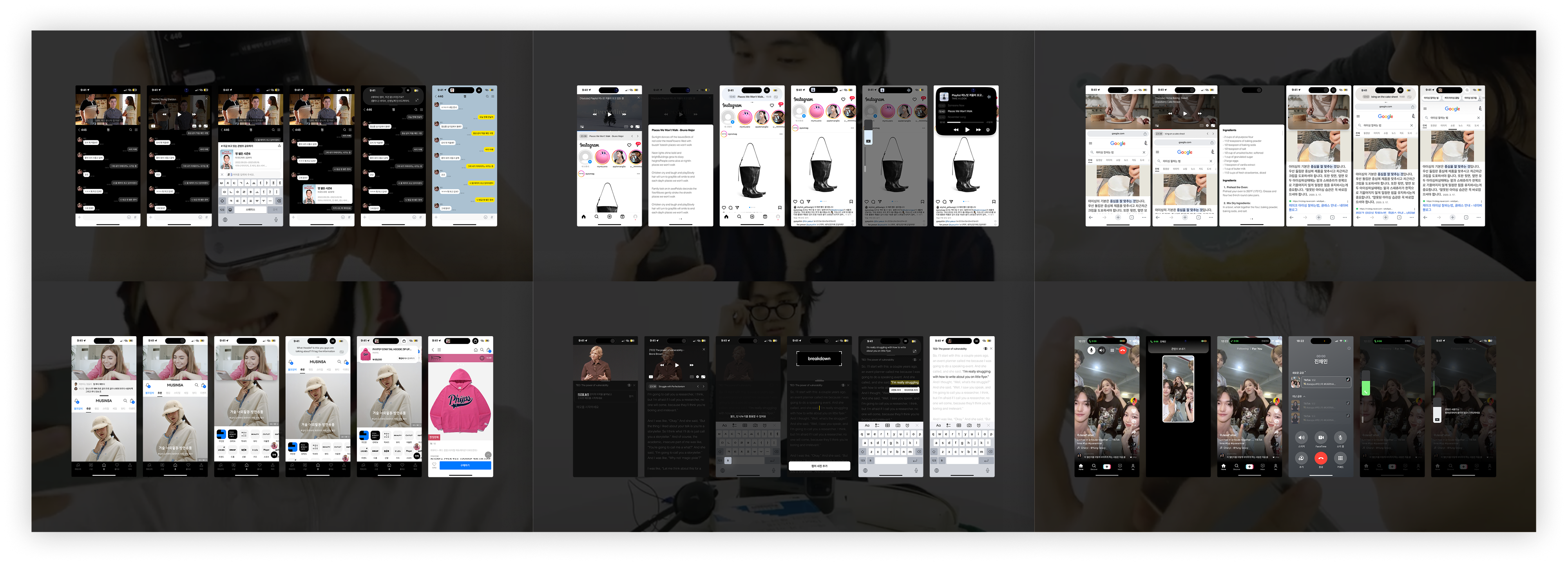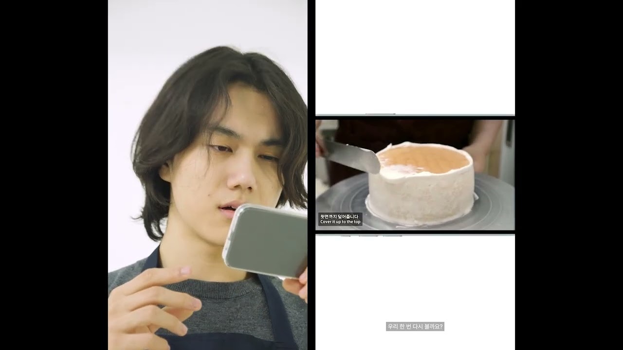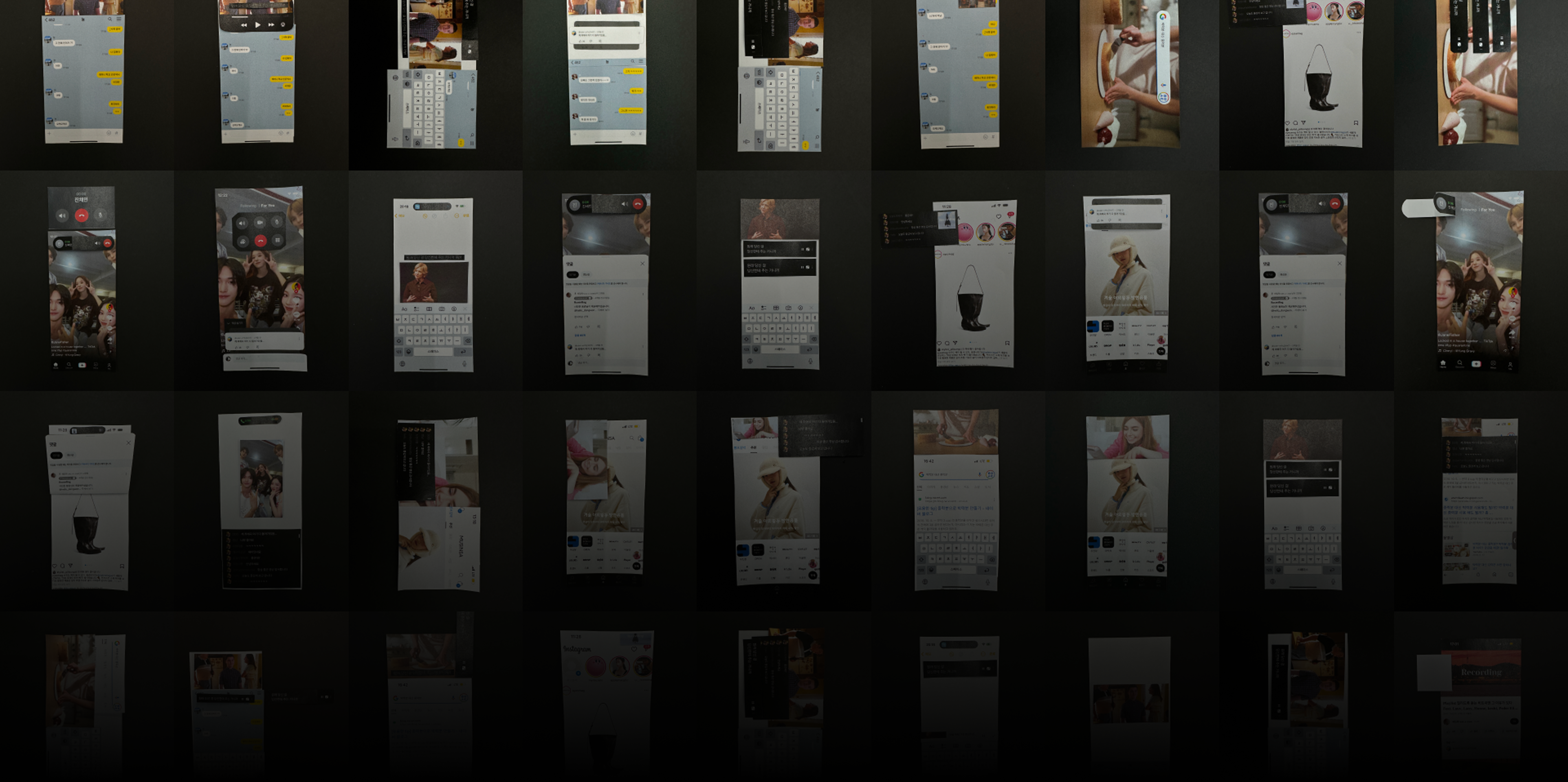
Hero — phone screen collage grid
🏆 2023 Graduation Exhibition — Grand Prize (60th Anniversary Award) 2023 졸업전시 — 대상 (60주년 기념상) 2023年卒業展示 — グランプリ(60周年記念賞)

02 / 03   Case Study

Dynamic
Multitasking
다이나믹
멀티태스킹
ダイナミック
マルチタスキング

Duration기간期間 Sep – Dec 2023 · 10 weeks
Platform플랫폼プラットフォーム Mobile iOS
Role역할役割 Designer 2p · 50%
Scroll스크롤スクロール
01

A video-centric multitasking system built from scratch — originating from a simple observation that existing mobile multitasking fails to reflect the context between what users are actually doing. Refined through four rounds of user testing.

새롭게 설계한 비디오 중심 멀티태스킹 시스템. 기존 모바일 멀티태스킹이 사용자 행동 간 맥락을 반영하지 못한다는 문제의식에서 출발해, 4번의 사용자 테스트를 거쳐 개발했습니다.

「ビデオを見ながら別の作業をする」日常に、iOSはまだ追いついていない。そのシンプルな問いから始まり、4回のユーザーテストを経て生まれたビデオ中心のマルチタスキングシステムです。

We defined six everyday scenarios where video and a second task compete for the same screen, then built a system to let them coexist.

비디오와 다른 작업이 하나의 화면을 두고 경쟁하는 6가지 일상적 시나리오를 정의하고, 이들이 자연스럽게 공존하는 시스템을 만들었습니다.

ビデオと別のタスクが同じ画面を奪い合う6つの日常シナリオを定義し、自然に共存できるシステムを設計しました。

User flow of multitasking various videos and other activitiesUser flow of multitasking various videos and other activities
02Context & Problem맥락 & 문제コンテキスト & 問題

Multitasking on mobile is growing — but the UI hasn't caught up with how people actually switch between tasks.

멀티태스킹 경험은 늘어나고 있지만, UI는 아직 사용자 행동 간의 맥락을 담지 못하고 있습니다.

マルチタスキングの需要は高まっているのに、UIはまだユーザーの行動の文脈を捉えていない。

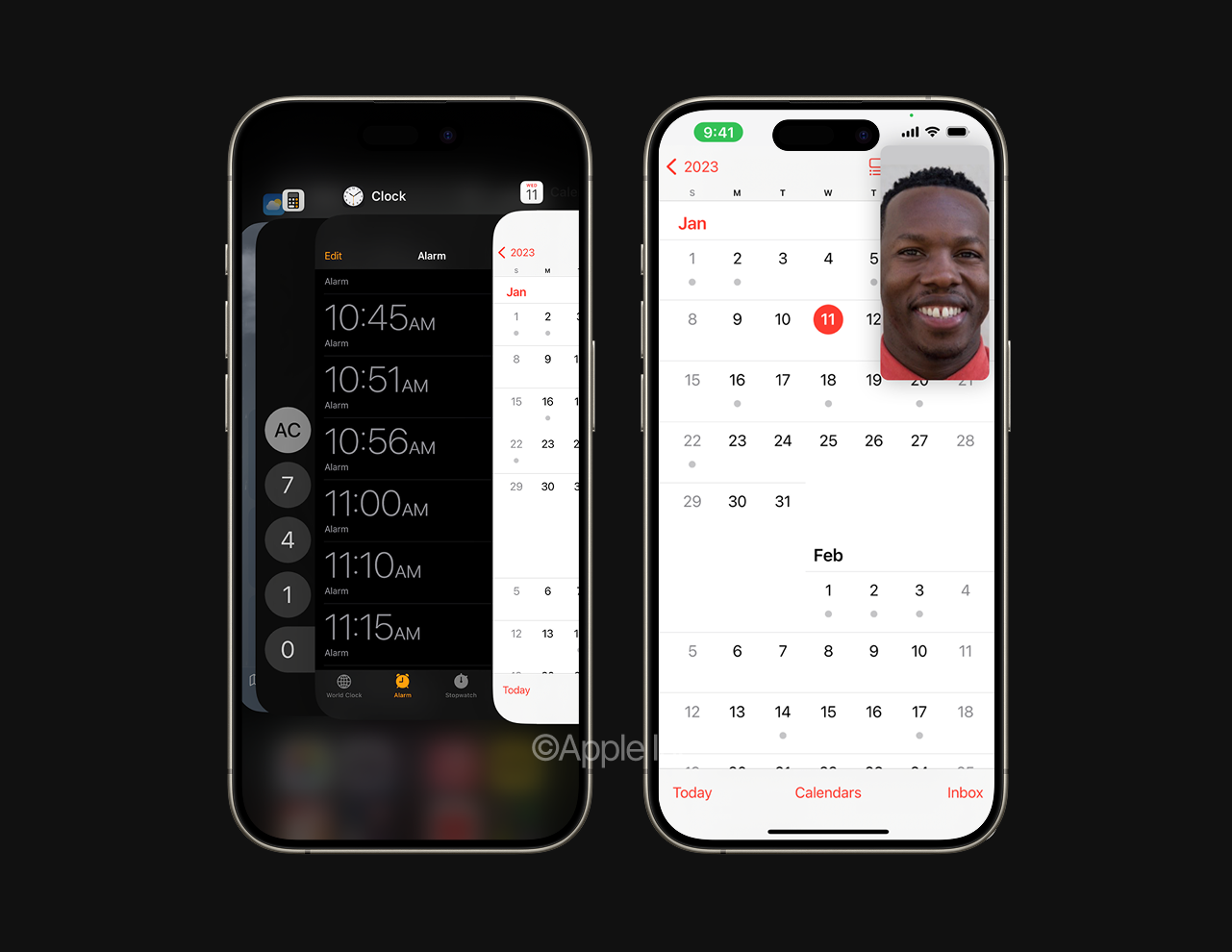
Mobile screens are naturally limited, making multitasking with video — demanding both visual and auditory focus — a challenge. Unlike Android which offers Split View and PiP, iOS only provides PiP functionality.

모바일 화면은 좁고, 비디오는 시각·청각 모두를 요구합니다. Android는 Split View와 PiP를 모두 지원하지만, iOS는 PiP만 제공합니다.

スマホの画面は狭く、動画は視覚と聴覚の両方を要求します。AndroidがSplit ViewとPiPを備える中、iOSが提供するのはPiPのみ。

"What if video-centric multitasking on a mobile device felt truly seamless?"

"모바일에서의 비디오 중심 멀티태스킹이 더 자연스러워질 수 있다면?"

"スマホでのビデオ×マルチタスキングを、もっと自然にできないか?"

Increasing multitasking experience on mobile devicesIncreasing multitasking experience on mobile devices
Multitasking and videosMultitasking and videos
03Research Process리서치 프로세스リサーチプロセス

Four-stage research —
define, resolve, validate.

4단계 리서치 —
정의하고, 해결하고, 검증했습니다.

4段階リサーチ —
定義し、解決し、検証した。

01
User Survey사용자 설문조사ユーザーサーベイ

Multitasking experience in a single mobile device including video. Decided 6 scenarios people use frequently.비디오를 포함한 모바일 멀티태스킹 경험 조사. 자주 사용하는 6가지 시나리오 도출.動画を含むモバイルマルチタスキング体験を調査。頻繁に使う6シナリオを決定。

n=65 · Born 1995–2004 · iOS 48 / Android 17 · 21 questions ~20min

02
Collaborative Workshop협업 워크숍コラボワークショップ

Building UI layouts for multitasking scenarios using modular components. ~180 sketches.모듈 컴포넌트로 멀티태스킹 UI 레이아웃 구성. 약 180개 스케치.モジュラーコンポーネントでUIレイアウトを構成。約180枚のスケッチ。

n=11 · Design professionals + students · 1hr/participant

03
Usability Test 1사용성 테스트 1ユーザビリティテスト1

Sketch comparison on 5-point scale. Established Do & Don't for each scenario based on information density, multitasking ease, and usability.5점 척도로 스케치 비교. 정보 밀도, 멀티태스킹 편의성, 사용성 기준 DO & DON'T 도출.5点尺度でスケッチを比較。DO & DON'Tを確立。

n=7 · Design professionals + students · 60min

04
Usability Test 2 — As-Is vs To-Be사용성 테스트 2 — As-Is vs To-Beユーザビリティテスト2

Prototype validation on 7-point scale: Usability · Multitasking Ease · Interface Aesthetics · User Satisfaction.7점 척도 프로토타입 검증: 사용성 · 멀티태스킹 편의성 · 심미성 · 사용자 만족도.7点尺度でプロトタイプ検証。

n=10 · iPhone users · 1hr/participant

04Research 1 — Survey리서치 1 — 설문조사リサーチ1 — サーベイ

Users acknowledge the benefits of multitasking — but feel discomfort with how it's delivered.

멀티태스킹 자체의 필요성은 인정하지만, 지금 방식은 불편합니다.

マルチタスキングの価値は感じている。ただ、今の使い心地には満足していない。

3.4/5Average satisfaction — neutral to slightly satisfied평균 만족도 — 보통~약간 만족平均満足度 — 普通〜やや満足
50%Slightly satisfied약간 만족やや満足
iOSParticularly low satisfaction vs Android — PiP onlyAndroid 대비 특히 낮은 만족도Androidと比較して特に低い満足度
Survey — satisfaction detail stripSurvey — satisfaction detail strip

Reasons for satisfaction

만족 이유

満足の理由

Perform other tasks without interrupting video playback비디오 재생을 방해하지 않고 다른 작업 수행動画再生を中断せずに他のタスクを実行

Time efficiency · Reduced boredom시간 효율성 · 지루함 감소時間効率 · 退屈感の軽減

Reasons for dissatisfaction

불만족 이유

不満の理由

Screen elements obscured, making interactions difficult화면 요소가 가려져 상호작용이 어려움画面要素が隠れてインタラクションが困難

Difficulty focusing on both tasks · Video screen too small두 작업 모두에 집중하기 어려움 · 비디오 화면이 너무 작음両タスクへの集中困難 · 動画画面が小さすぎる

6 scenario combinations defined

6가지 시나리오 조합 설정

6つのシナリオの組み合わせを定義

CodeVideo (A)비디오 (A)ビデオ (A)Task (B)작업 (B)タスク (B)
A1Short-form숏폼ショートフォームVoice Call음성 통화音声通話
A2Live Streaming라이브 스트리밍ライブ配信Shopping쇼핑ショッピング
A3Series / Movie시리즈 / 영화シリーズ / 映画Messenger메신저メッセンジャー
A4Tutorial Video튜토리얼 비디오チュートリアル動画Search Engine검색 엔진検索エンジン
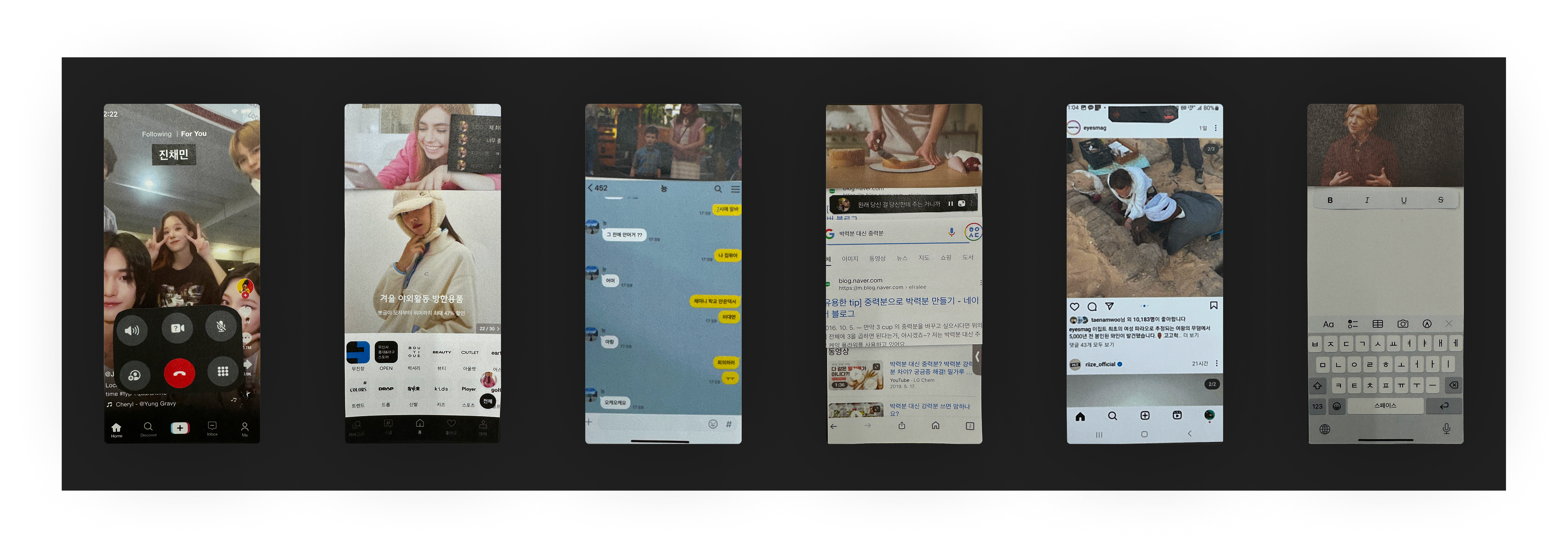
A5Music Playlist음악 플레이리스트音楽プレイリストInstagram인스타그램インスタグラム
A6Lecture강의講義Notes메모メモ
05Research 2 — Workshop리서치 2 — 워크숍リサーチ2 — ワークショップ

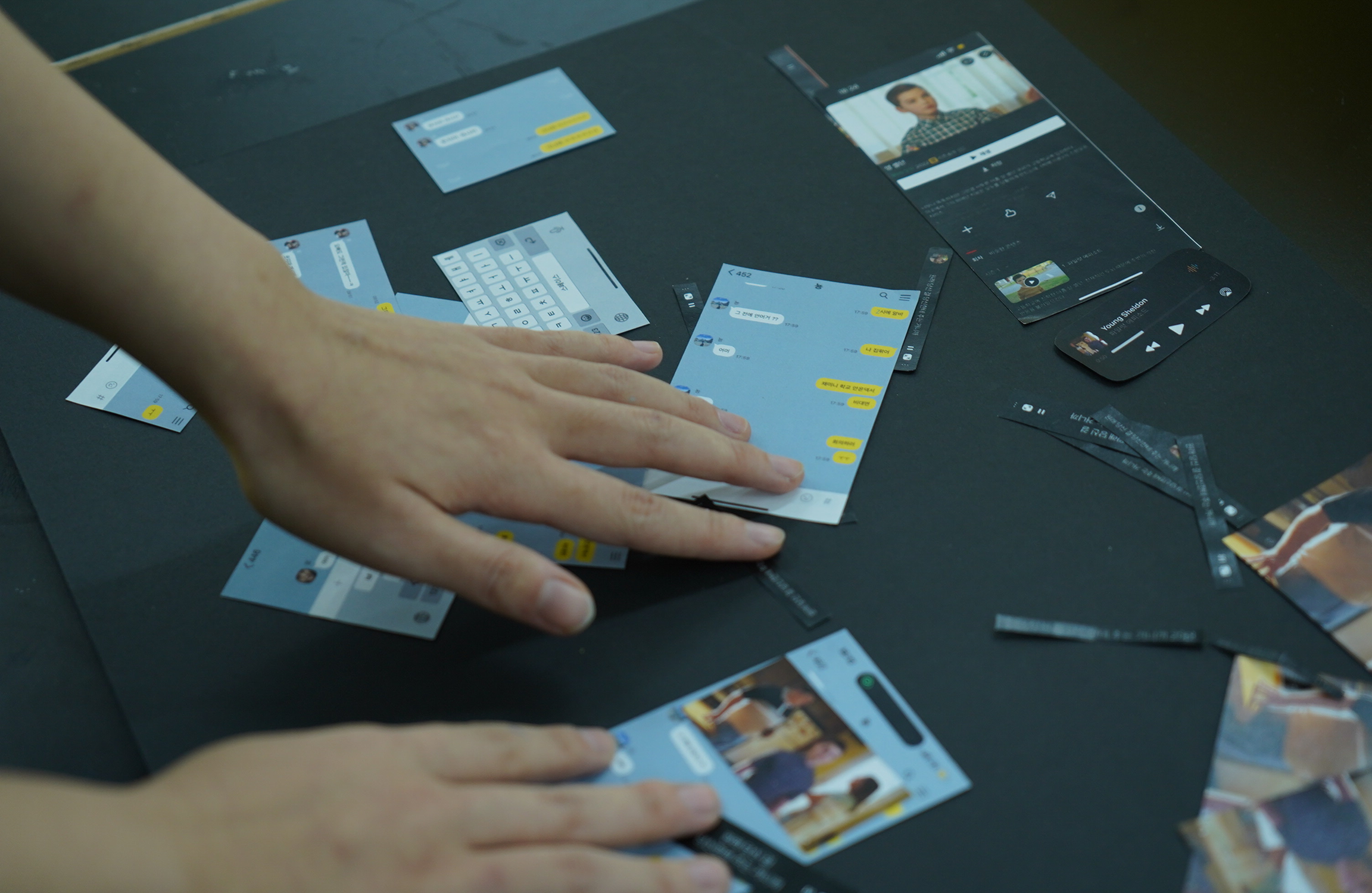
Participants assembled multitasking displays using modular components.

참가자들이 모듈 컴포넌트로 멀티태스킹 화면을 직접 조립했습니다.

参加者がモジュラーコンポーネントを使用してマルチタスキングディスプレイを組み立てました。

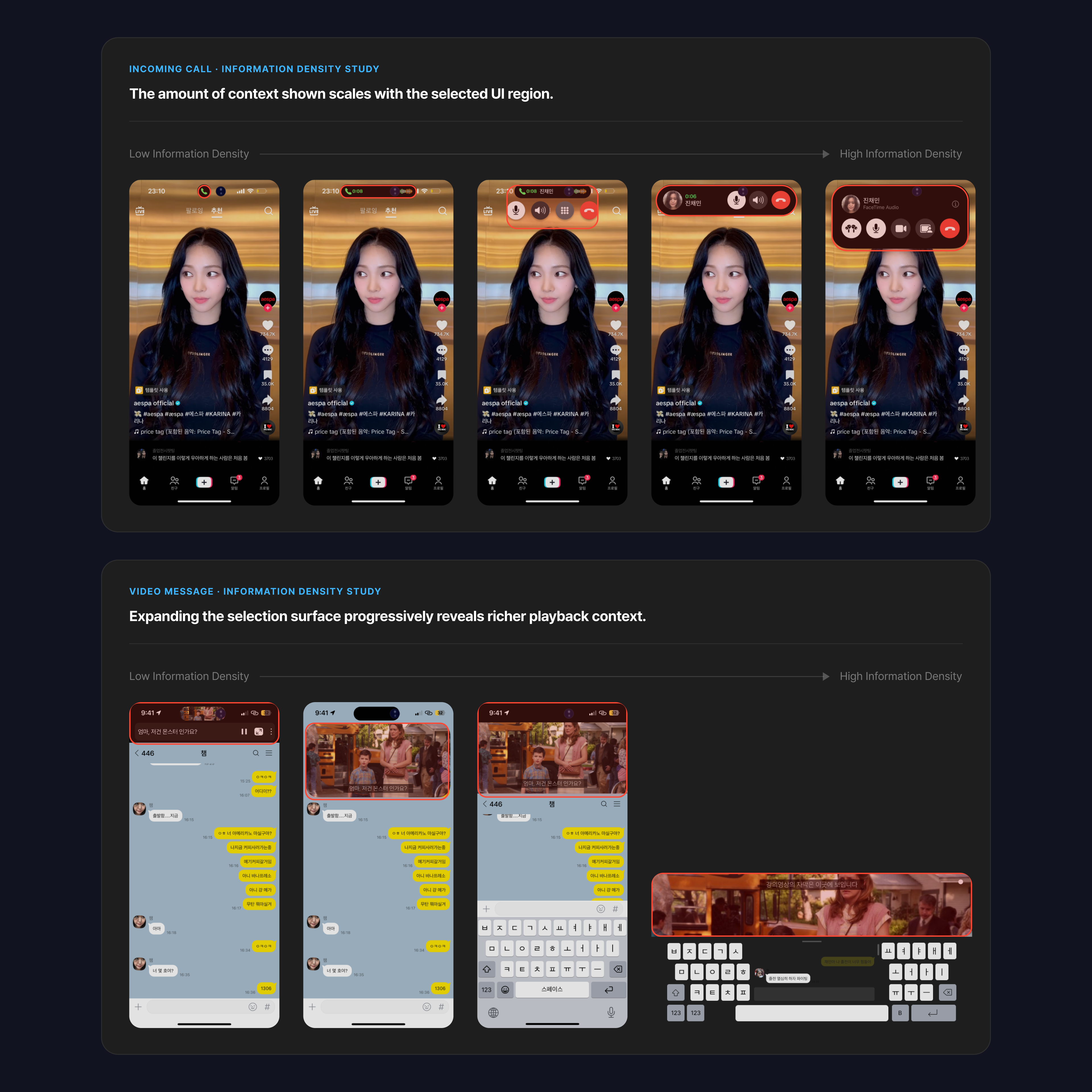
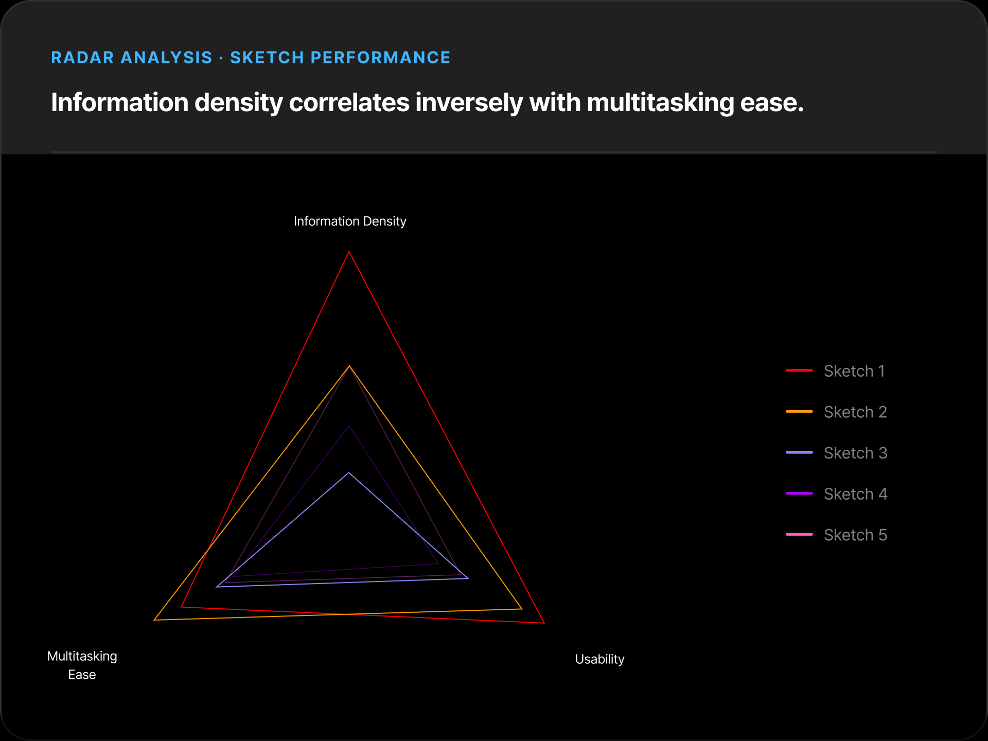
~180 sketches → grouped into 4–5 screens per scenario using "information density" as the primary criterion (video size + modality: visual / audio / text).

약 180개의 스케치 → 시나리오당 4–5개 화면으로 그룹화. 기준: "정보 밀도" (비디오 크기 + 모달리티: 시각 / 오디오 / 텍스트).

約180枚のスケッチ → シナリオあたり4〜5画面にグループ化。基準: 「情報密度」

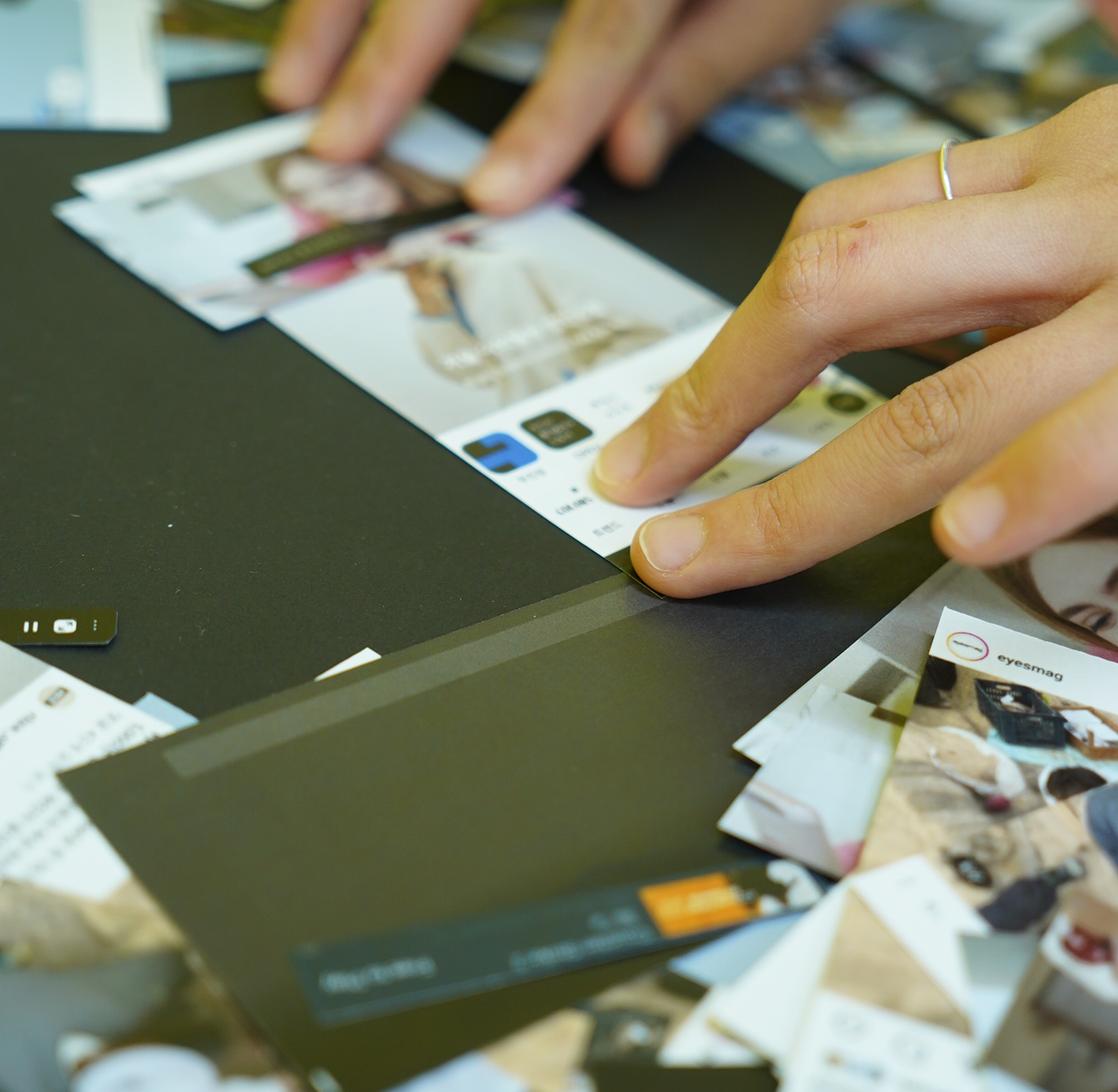
Workshop — sketches on tableWorkshop — sketches on table (photo)
Workshop — hands sorting cardsWorkshop — hands sorting cards (photo)
Sketch component strip — 6 screensSketch component strip — 6 screens
"

For audiobook-like content with minimal visuals, the screen isn't necessary. But sometimes I just want lyrics or to skip tracks.

오디오북처럼 시각 요소가 적은 콘텐츠는 화면이 필요 없어요. 다만 가끔 가사를 보거나 곡을 넘기고 싶을 때는 있어요.

オーディオブックのようなコンテンツは画面不要。ただ歌詞を見たり曲を飛ばしたい時はあります。

"

I don't think multitasking allows 100% focus. Subtitles and audio are enough to avoid missing the flow.

멀티태스킹으로 100% 집중은 어렵다고 생각해요. 자막과 소리만 있어도 흐름을 놓치지 않아요.

マルチタスキングで100%集中は無理。字幕と音声で流れを追えれば十分。

"

If I find clothes I like, I'd reduce the video size and focus more on shopping.

마음에 드는 옷을 발견하면 비디오 크기를 줄이고 쇼핑에 더 집중하겠어요.

気に入った服を見つけたら、動画を小さくしてショッピングに集中します。

"

During calls, I watch short-form content visually rather than listening. Sometimes I share funny videos with the other person.

통화 중엔 숏폼을 듣기보다 시각적으로 봐요. 가끔 재밌는 영상을 상대방과 공유하기도 해요.

通話中はショート動画を聴くより見ます。時々相手と面白い動画を共有することも。

Information density spectrumInformation density spectrum — designed graphic
06Usability Test 1사용성 테스트 1ユーザビリティテスト1

Comparing screens per scenario on a 5-point scale.

5점 척도로 시나리오별 화면을 비교했습니다.

5点尺度でシナリオ別画面を比較。

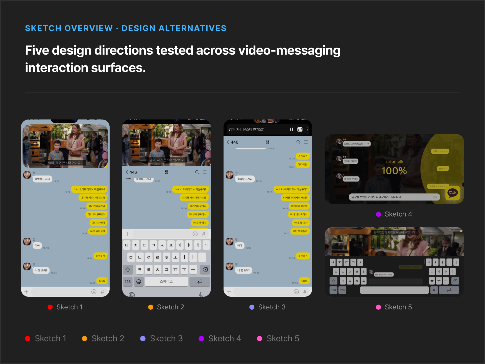
Study with 7 design professionals (60 min). Established DOs and DON'Ts for each scenario.

7명의 디자인 전문가 대상 (60분). 각 시나리오의 DO / DON'T 도출.

デザインの専門家7名(60分)。各シナリオのDO / DON'Tを確立。

Series / Movies + Messenger — key findings

시리즈/영화 + 메신저 — 주요 발견

シリーズ/映画 + メッセンジャー — 主な発見

Portrait mode is essential when typing with a keyboard키보드 입력 시 세로 모드가 필수적キーボード入力時はポートレートモードが必須

Chatting is prioritized over following drama content드라마 시청보다 채팅이 우선ドラマ視聴よりチャットが優先

Floating/moving video positions cause discomfort — video at top feels most natural떠다니는 비디오 위치는 불편함 유발 — 화면 상단이 가장 자연스러움フローティング動画位置は不快 — 画面上部が最も自然

UT1 — visual 1UT1 — visual 1
UT1 — visual 2UT1 — visual 2
07Key Findings핵심 발견主な発見

Users need fluid switching between PiP and Split — and something in between that neither currently offers.

PiP와 Split 사이를 자연스럽게 오갈 수 있어야 하고, 그 사이를 이어줄 새로운 중간 뷰가 필요합니다.

PiPとSplitの間をスムーズに行き来できること、そしてその間をつなぐ新しい中間ビューが必要だとわかった。

01
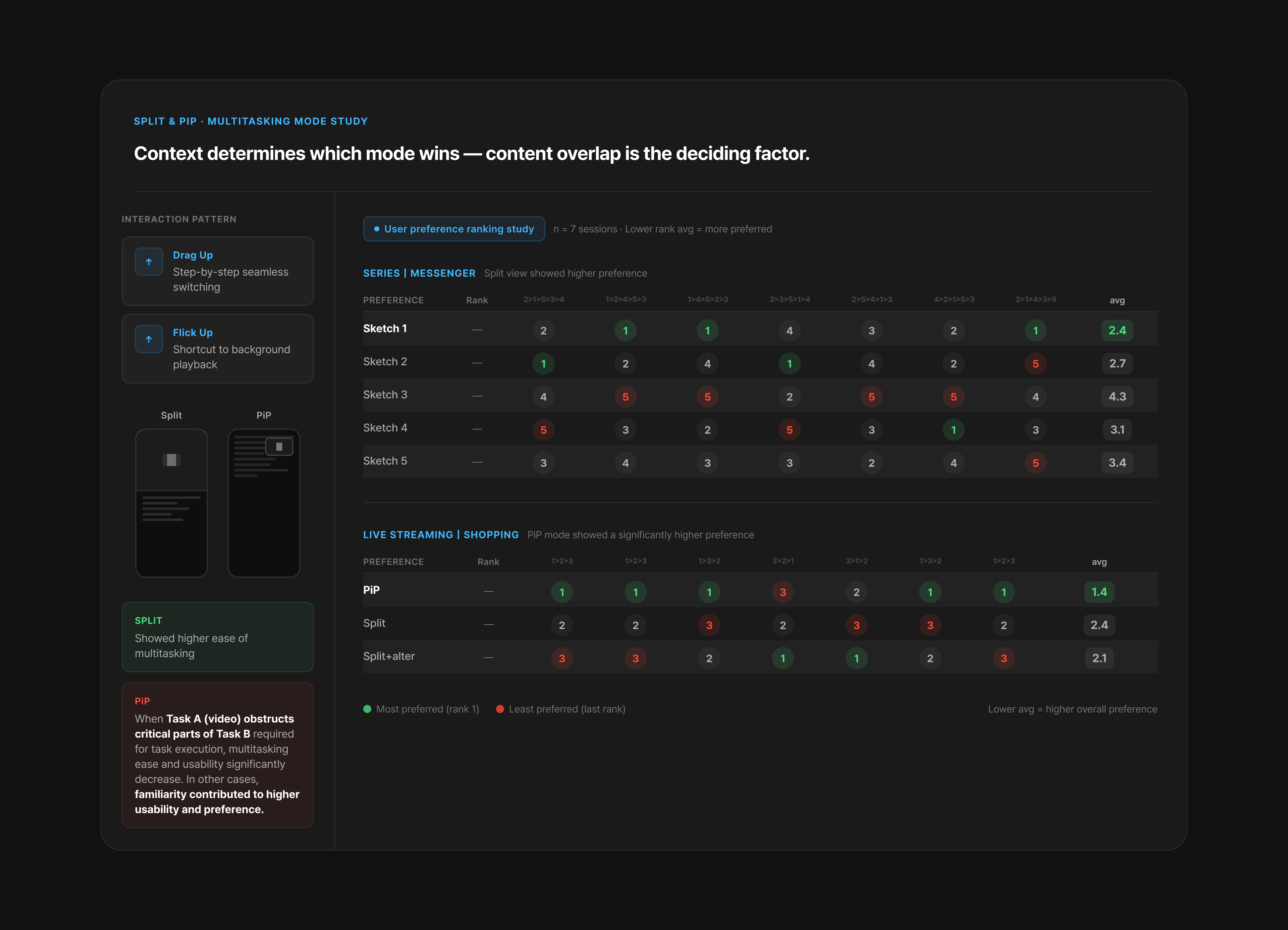
Split vs PiP — context-dependent preferenceSplit vs PiP — 맥락에 따른 선호Split vs PiP — 文脈依存の好み

Split showed higher multitasking ease (Series | Messenger). PiP preferred when Task A obstructs critical parts of Task B — Live Streaming | Shopping showed significantly higher PiP preference.Split은 멀티태스킹 편의성이 높았습니다(시리즈|메신저). Task A가 Task B의 핵심 부분을 가릴 때는 PiP 선호도가 높았습니다(라이브 스트리밍|쇼핑).SplitはマルチタスキングEaseが高い(シリーズ|メッセンジャー)。AがBを遮る場合はPiP選好が高い(ライブ配信|ショッピング)。

Split vs PiP — comparison visualSplit vs PiP — comparison visual
02
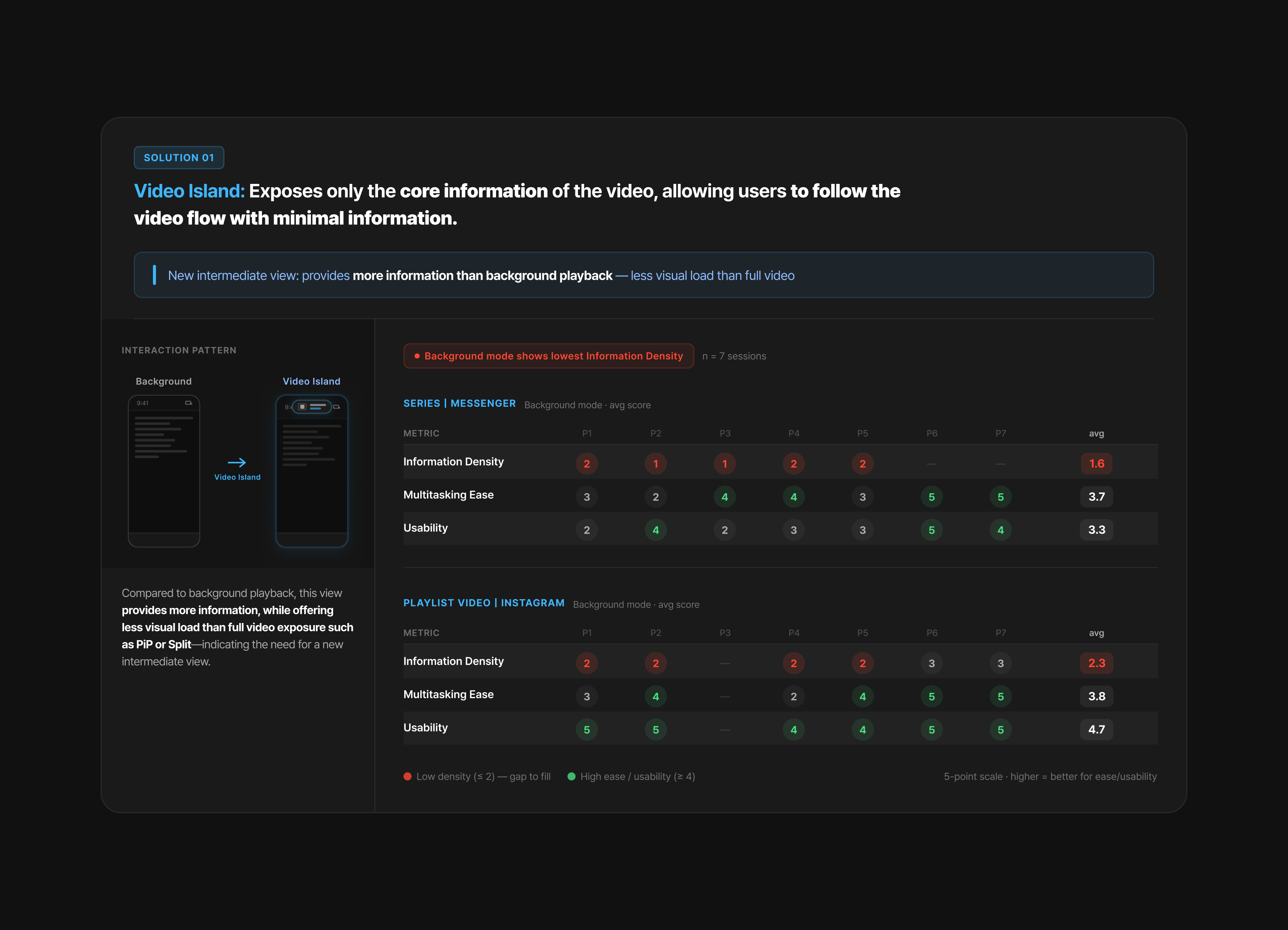
Video Island — a new intermediate view비디오 아일랜드 — 새로운 중간 뷰ビデオアイランド — 新しい中間ビュー

More information than background playback, less visual load than full PiP or Split. Exposes only core video information so users can follow the flow with minimal information.백그라운드 재생보다 더 많은 정보를, PiP·Split보다 적은 시각적 부담을 제공. 핵심 정보만 노출해 최소한의 정보로 흐름을 따라갈 수 있게 함.バックグラウンド再生より情報が多く、PiP・Splitより視覚負荷が少ない中間ビュー。

Video Island — comparison visualVideo Island — comparison visual
08Final Solution최종 솔루션最終ソリューション

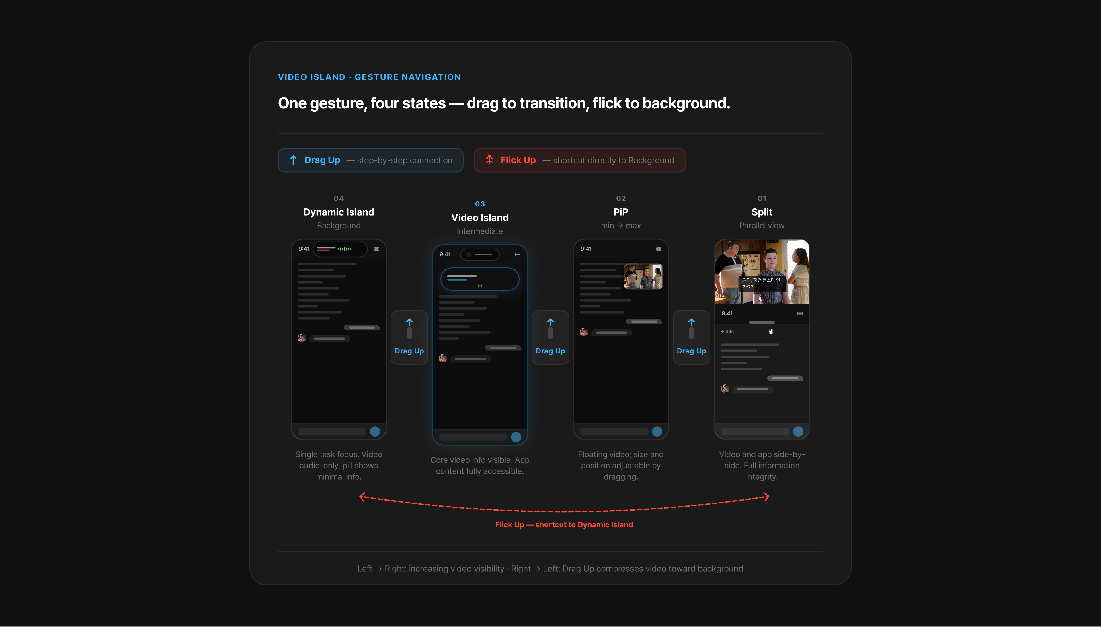
"Split → PiP → Video Island → Dynamic Island. One continuous flow that didn't exist before."

"Split → PiP → 비디오 아일랜드 → 다이나믹 아일랜드. 하나로 이어지는 멀티태스킹 플로우를 만들었습니다."

"Split → PiP → ビデオアイランド → ダイナミックアイランド。一本につながったフローを作りました。"

Drag Up for step-by-step switching, Flick Up to jump directly to Dynamic Island from any mode.

드래그 업은 단계별 전환, 플릭 업은 다이나믹 아일랜드로 바로 이동.

ドラッグアップでひとつずつ切り替え、フリックアップでダイナミックアイランドへ即ジャンプ。

Gesture navigation diagram — 4 states, drag / flick upGesture navigation diagram — 4 states, drag / flick up

Split

Split

분할 화면

スプリット

Parallel structure that preserves information integrity.

정보 무결성을 보존하는 병렬 구조.

情報の整合性を保つ並列構造。

→ Drag Up

PiP (min–max)

PiP (최소–최대)

PiP(最小〜最大)

Adjust screen size and position for flexible viewing.

유연한 시청을 위한 화면 크기와 위치 조정.

柔軟な視聴のための画面サイズと位置調整。

→ Drag Up

Video Island

비디오 아일랜드

ビデオアイランド

Only essential key information. Genre-specific.

필수 핵심 정보만 표시. 장르에 맞춤.

必須情報のみ。ジャンル特化。

→ Flick Up

Dynamic Island

다이나믹 아일랜드

ダイナミックアイランド

Background playback — focus on a single task.

백그라운드 재생 — 단일 작업에 집중.

バックグラウンド再生 — 単一タスクに集中。

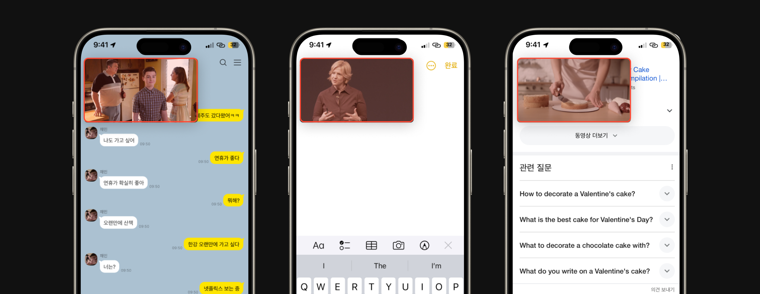
Video Island — genre-specific information

비디오 아일랜드 — 장르별 정보

ビデオアイランド — ジャンル別情報

When you can't afford to miss the flow of the video, Video Island selectively presents only the relevant information tailored to the genre.

비디오 흐름을 놓치기 아쉬울 때, 비디오 아일랜드는 장르에 맞는 핵심 정보만 선별해 보여줍니다.

動画の流れが気になるとき、ビデオアイランドはジャンルに合わせた最低限の情報だけを表示します。

Product walkthrough — final solution (video) Product walkthrough — final solution (video)
09Usability Test 2 — Validation사용성 테스트 2 — 검증ユーザビリティテスト2 — 検証

An average improvement of 2.0 points across all six scenarios, on a 7-point scale.

6개 시나리오 전체에서 평균 2.0점 향상 (7점 만점 기준).

全6シナリオで平均2.0ポイント向上(7点満点)。

Evaluation Criteria

평가 기준

評価基準

Usability
1. Easy to use with minimal operational difficulty · 2. Smooth transitions between steps · 3. Low error rate during use · 4. Functions of on-screen elements are easy to understand · 5. Layout can be controlled flexibly as needed · 6. Information is presented in an efficient and logical order1. 최소한의 조작 어려움으로 사용하기 쉬움 · 2. 단계 간 전환이 매끄러움 · 3. 사용 중 오류율이 낮음 · 4. 화면 요소의 기능을 이해하기 쉬움 · 5. 필요에 따라 레이아웃을 유연하게 제어 가능 · 6. 정보가 효율적이고 논리적인 순서로 제시됨1. 最小限の操作難易度 · 2. スムーズな遷移 · 3. 低エラー率 · 4. 画面要素の理解しやすさ · 5. 柔軟なレイアウト制御 · 6. 効率的で論理的な情報提示
Multitasking
Ease
Two activities proceed smoothly without breaking flow · Able to focus on both activities · A does not interfere with B and vice versa · Full control over each activity's interactions · No difficulty understanding either A or B두 활동이 흐름을 끊지 않고 원활히 진행 · 두 활동 모두에 집중 가능 · A와 B가 서로 방해하지 않음 · 각 활동의 인터랙션 완전 제어 · A, B 정보 이해에 어려움 없음2つの活動がフローを崩さず進行 · 両方に集中可能 · AとBが互いに妨げない · 各操作を完全コントロール
Interface
Aesthetics
1. Positive first impression · 2. Screen elements feel cohesive · 3. Layout and information are visually well-organized · 4. Minimal, uncluttered design · 5. Consistent UI throughout the experience1. 긍정적인 첫인상 · 2. 화면 요소가 일체감 있게 느껴짐 · 3. 레이아웃과 정보가 시각적으로 잘 정리됨 · 4. 미니멀하고 깔끔한 디자인 · 5. 경험 전반에 걸쳐 일관된 UI1. ポジティブな第一印象 · 2. 画面要素の一体感 · 3. レイアウトの整理 · 4. ミニマルでスッキリ · 5. 一貫したUI
User
Satisfaction
Overall satisfaction level · Reasons for satisfaction or dissatisfaction · Likelihood of frequent use · Most useful features in this scenario · Features considered unnecessary전반적인 만족도 · 만족/불만족 이유 · 자주 사용할 가능성 · 가장 유용한 기능 · 불필요하다고 생각되는 기능全体的な満足度 · 満足/不満の理由 · 頻繁な使用可能性 · 最も有用な機能 · 不要と思われる機能

As-Is vs To-Be Results (7-point scale)

As-Is vs To-Be 결과 (7점 척도)

As-Is vs To-Be 結果(7点尺度)

Scenario시나리오シナリオCriteria기준基準As-IsTo-BeΔ
Series | MessengerUsability4.35.6+1.3
Series | MessengerMultitasking Ease3.76.0+2.3
Series | MessengerInterface Aesthetics3.75.8+2.1
Series | MessengerUser Satisfaction3.75.8+2.1
Playlist | InstagramUsability4.76.1+1.4
Playlist | InstagramMultitasking Ease4.36.4+2.1
Playlist | InstagramInterface Aesthetics4.46.4+2.0
Playlist | InstagramUser Satisfaction3.76.4+2.7
Tutorial | GoogleUsability4.65.5+0.9
Tutorial | GoogleMultitasking Ease4.06.0+2.0
Tutorial | GoogleInterface Aesthetics4.25.7+1.5
Tutorial | GoogleUser Satisfaction4.25.8+1.6
Live Streaming | ShoppingUsability4.45.1+0.7
Live Streaming | ShoppingMultitasking Ease3.65.5+1.9
Live Streaming | ShoppingInterface Aesthetics4.35.3+1.0
Live Streaming | ShoppingUser Satisfaction3.75.1+1.4
Lectures | NotesUsability3.85.4+1.6
Lectures | NotesMultitasking Ease3.26.0+2.8
Lectures | NotesInterface Aesthetics3.85.9+2.1
Lectures | NotesUser Satisfaction2.95.4+2.5
Short-form | Voice CallUsability4.25.9+1.7
Short-form | Voice CallMultitasking Ease3.96.3+2.4
Short-form | Voice CallInterface Aesthetics4.46.1+1.7
Short-form | Voice CallUser Satisfaction3.75.9+2.2

One notch. Two gestures. The biggest constraint became the system itself.

하나의 노치, 두 개의 제스처 — 가장 큰 제약이 그대로 시스템이 되었습니다.

ノッチひとつ、ジェスチャーふたつ。最大の制約が、そのままシステムになった。

Next — 03 / 03

다음 — 03 / 03

次へ — 03 / 03

Social Discovery Service